Design an interactive music library visualizer, displaying data using color, size, and shape.
Client — Academic Project
Duration — 3 months
Technology — HTML/CSS/JS, D3.js
Project Brief
Using data from my Spotify playlist, this interactive application explored how to create a new visual experience for browsing a music library and visualizing music playing. This project included several areas of development, including visual user interface design and front-end web development. The final app prototype was built as a web application using D3.js for building the front-end user interface.
Background
Applications for browsing and selecting music are a staple of any device or operating system, from desktop application to web-based tools. From iTunes to Spotify, these applications are of frequent usage. However, their visual appearance and design has never changed greatly, still consisting of rows of songs and columns of data. Few also look to creating a visual experience for the music playback.
Strategy
Looking at information design as an inspiration, this project explored how to redesign a music library and music player, emphasizing visual elements and interactive design for revealing information. By taking this approach, this project looked to reimagine how the user experience of a music library could be created.
Design Solution
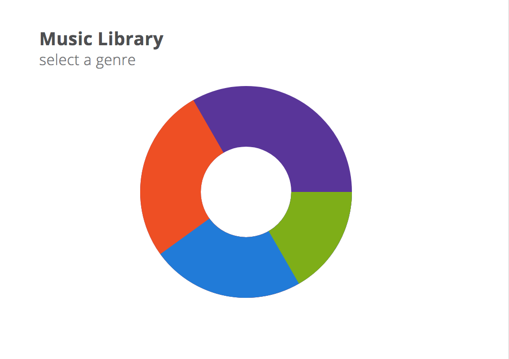
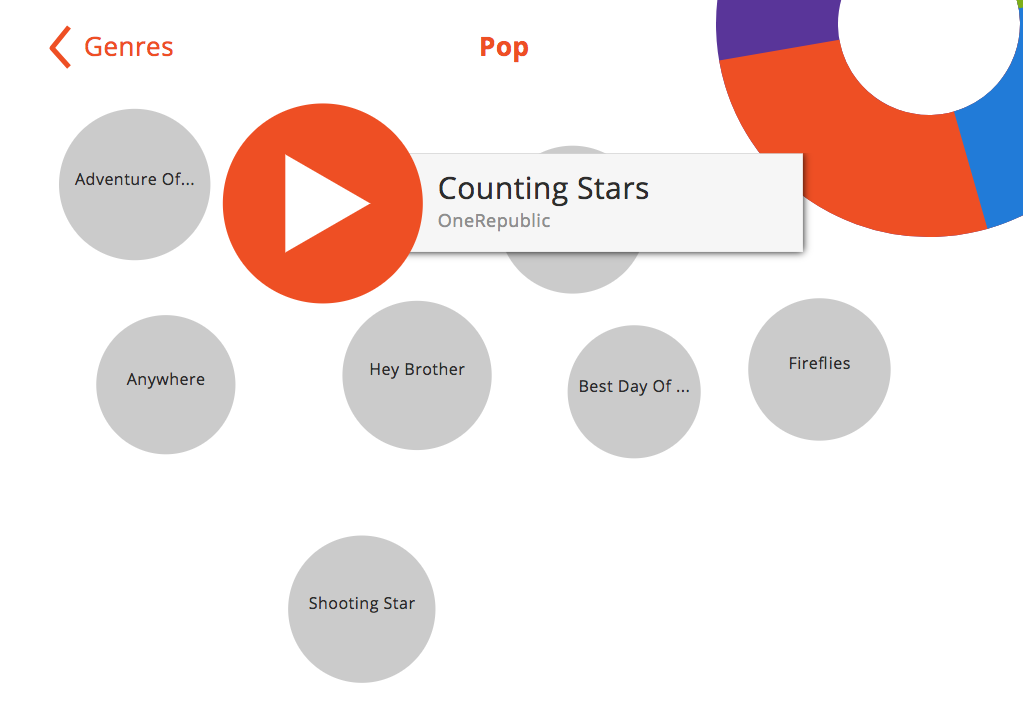
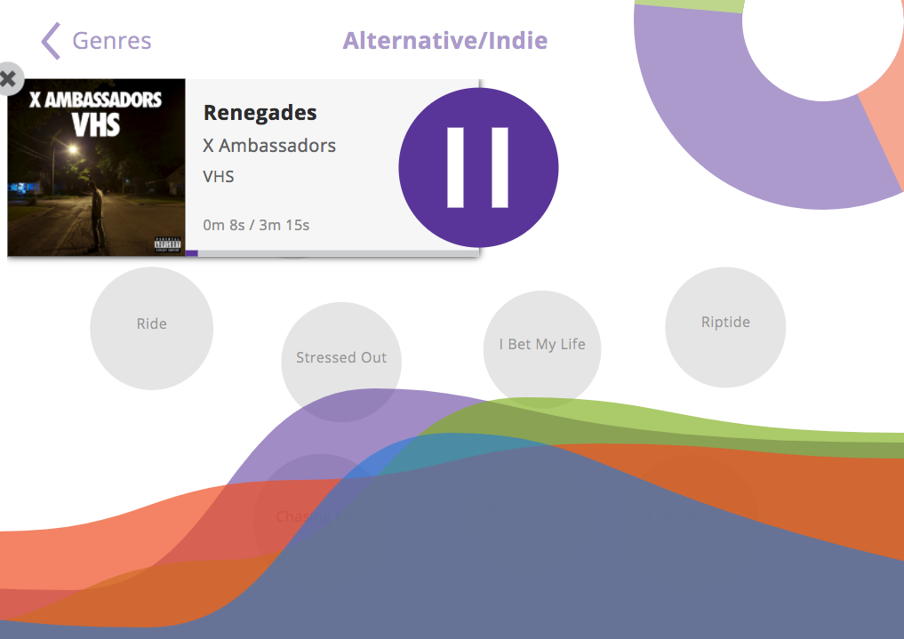
The design began with reimagining how a song would be selected. At start, users would be presented a donut chart of the genres available, each with a unique color. From here, users could select which genre to browse. Once a genre is selected, users are then presented all the songs in the selected genre, each represented as a circle. The circle’s radius is based on the song’s duration—longer songs have a greater radius. Users can then hover over each song to view the song title and artist. When a song is selected, the song player card appears, displaying the song’s album cover, album name, song title, and artist, and play progress. Here, the music visualizer is also present, drawing from frequency data of the song playing to animate wavy shapes.
Challenges
The primary challenge of this project was the technological development, primarily around the animated music visualizer. After extensive research of SVG cubic bezier curves, a method of dynamically animating to the music. For every frame, with 60 frames per second, a new cubic bezier curve was created, using the equalizer data retrieved through JavaScript Web Audio API.
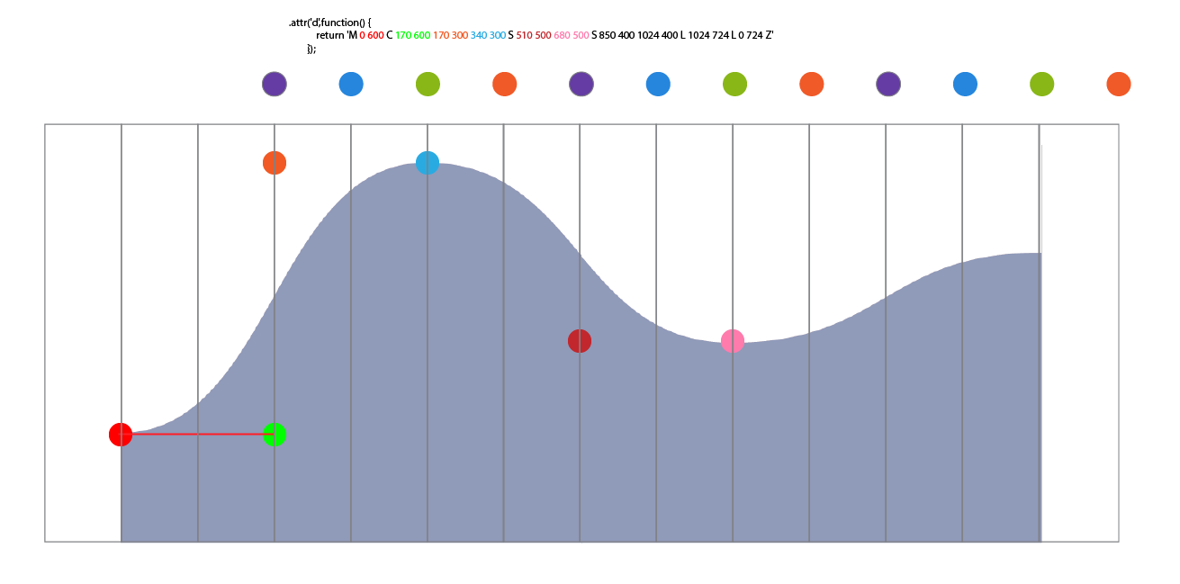
Further the design had four bezier curves, with each animating to a different frequency of the song.
Additional Information
This project was built on open-source technologies. A complete list of these are listed below, along with their license information.

You must be logged in to post a comment.